New Site Features
With ever-changing technology, it is important for the Lee website to morph into alignment with these changes and provide a top-notch experience for those who use the website. In order for the website to stay relevant and up to date, the web development team will be implementing changes to the site to provide a more user-friendly experience. Below you will find a few of the upcoming changes to the site.
New Menu
The new menu feature will be implemented in subsections of the main university website. This change allows us to use the full width of the page for information pertaining to the webpage and provides a mobile-friendly view when the user is navigating the site on their mobile device.
Old Menu
Old menu style on the desktop
New Menu
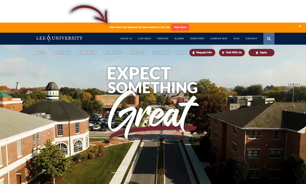
New Menu style on the desktop
Here is a sample header with new menu located on the left
Old menu style on the mobile device
New menu style on the mobile device
Notification Bar
At the top of this page, you will notice an orange notification bar has been embedded into the page. This feature will be used for important university alerts, updates, and other necessary notifications.
Side Buttons
On the home page of the main university site, there were three maroon buttons horizontally placed at the top right of the navigation bar. These buttons have now been moved vertically to the far-right side of the page and remain static as the user scrolls through the page. In the mobile view, these buttons can be seen at the bottom of the screen as a banner that stretches across the entire length of the screen. This banner will also remain static as the user scrolls through the main page on their mobile device.